The Project
In 2021 I was contracted to assist the Good Rx Design Team with Information Architecture for the company's internal design system. The team was updating the existing design system from a 1.0 to 2.0 version.
My role was to audit and organize the system, establish the architecture and guidelines, write documentation, and audit the completed design system to ensure the visual designers had the tools they needed to do their jobs successfully.
My Role
The Team
Timeline
Skills
Me
Design System Lead
2 Visual Designers
1 Developer
PM
Apr 2021- Dec 2021
Design Systems
Visual Design
PM
Project Requirements
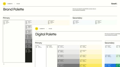
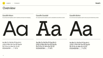
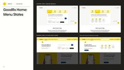
With existing Brand Guidelines in place, our team's mission was to catalog, organize, and implement designer-accessible components, tokens, and patterns for use across the desktop and mobile sites.
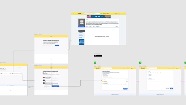
I started by conducting an audit and inventory of not only the design system itself, but also all UI elements and content on the Good Rx website & mobile app. I documented the location, asset type, and file format of each element, and conducted audits of the major application flows (such as Checkout) to ensure we accounted for any needed components.
A Figma file was created for the design system update, and also a Figjam board for brainstorming, organizing, and documentation. We used Miro for meetings with stakeholders who did not have access to Figma/Figjam.
The Process
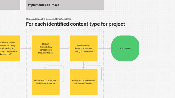
The team moved through several phases including discovery, planning, iteration, and testing, with daily check-ins and both scheduled and impromptu working sessions.
We designed and added new components if needed, and following a "mostly agile" methodology with fast, daily turnarounds.
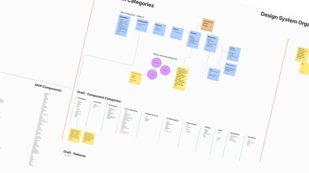
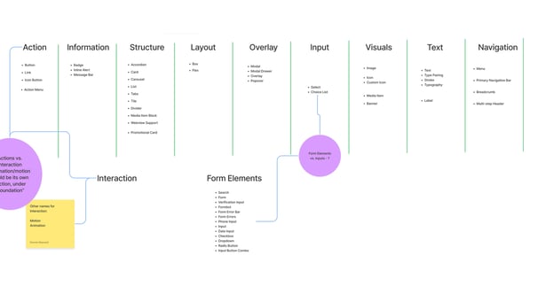
Working in Figjam and Miro entirely via Zoom, we collaborated on both the design and the architecture of the system, including taxonomy and a component naming scheme that would best serve the design team.

